Comparing Algorithms on Toy Datasets
The scikit-learn website showcases the characteristics of different hierarchical clustering methods on 2D toy datasets. Below we re-run this illustration on a larger data sample and with the Genie algorithm included.
TL;DR — See the bottom of the page for the resulting figure.
import time
import warnings
import numpy as np
import matplotlib.pyplot as plt
import pandas as pd
from sklearn import cluster, datasets
from sklearn.preprocessing import StandardScaler
from itertools import cycle, islice
import genieclust

np.random.seed(1234)
First, we generate the datasets. Note that in the
original script,
n_samples was set to 1500.
n_samples = 10000
noisy_circles = datasets.make_circles(n_samples=n_samples, factor=.5, noise=.05)
noisy_moons = datasets.make_moons(n_samples=n_samples, noise=.05)
blobs = datasets.make_blobs(n_samples=n_samples, random_state=8)
no_structure = np.random.rand(n_samples, 2), None

# Anisotropically distributed data
random_state = 170
X, y = datasets.make_blobs(n_samples=n_samples, random_state=random_state)
transformation = [[0.6, -0.6], [-0.4, 0.8]]
X_aniso = np.dot(X, transformation)
aniso = (X_aniso, y)

# blobs with varied variances
varied = datasets.make_blobs(n_samples=n_samples,
                             cluster_std=[1.0, 2.5, 0.5],
                             random_state=random_state)
Then, we run the clustering procedures and plot the results.
# Set up cluster parameters
plt.figure(figsize=(9 * 1.3 + 2, 14.5))
plt.subplots_adjust(left=.02, right=.98, bottom=.001, top=.96,
                    wspace=.05, hspace=.01)

plot_num = 1

default_base = {'n_neighbors': 10, 'n_clusters': 3}

datasets = [
    (noisy_circles, {'n_clusters': 2}),
    (noisy_moons, {'n_clusters': 2}),
    (varied, {'n_neighbors': 2}),
    (aniso, {'n_neighbors': 2}),
    (blobs, {}),
    (no_structure, {})]

for i_dataset, (dataset, algo_params) in enumerate(datasets):
    # update parameters with dataset-specific values
    params = default_base.copy()
    params.update(algo_params)

    X, y = dataset

    # normalize dataset for easier parameter selection
    X = StandardScaler().fit_transform(X)

    # ============
    # Create cluster objects
    # ============
    genie = genieclust.Genie(n_clusters=params['n_clusters'])
    ward = cluster.AgglomerativeClustering(
        n_clusters=params['n_clusters'], linkage='ward')
    complete = cluster.AgglomerativeClustering(
        n_clusters=params['n_clusters'], linkage='complete')
    average = cluster.AgglomerativeClustering(
        n_clusters=params['n_clusters'], linkage='average')
    single = cluster.AgglomerativeClustering(
        n_clusters=params['n_clusters'], linkage='single')

    clustering_algorithms = (
        ('Genie', genie),
        ('Single Linkage', single),
        ('Average Linkage', average),
        ('Complete Linkage', complete),
        ('Ward Linkage', ward),
    )

    for name, algorithm in clustering_algorithms:
        t0 = time.time()

        # catch warnings related to kneighbors_graph
        with warnings.catch_warnings():
            warnings.filterwarnings(
                "ignore",
                message="the number of connected components of the " +
                "connectivity matrix is [0-9]{1,2}" +
                " > 1. Completing it to avoid stopping the tree early.",
                category=UserWarning)
            algorithm.fit(X)

        t1 = time.time()
        if hasattr(algorithm, 'labels_'):
            y_pred = algorithm.labels_.astype(np.int_)
        else:
            y_pred = algorithm.predict(X)

        plt.subplot(len(datasets), len(clustering_algorithms), plot_num)
        if i_dataset == 0:
            plt.title(name, size=18)

        colors = np.array(list(islice(cycle(['#377eb8', '#ff7f00', '#4daf4a',
                                             '#f781bf', '#a65628', '#984ea3',
                                             '#999999', '#e41a1c', '#dede00']),
                                      int(max(y_pred) + 1))))
        plt.scatter(X[:, 0], X[:, 1], s=10, color=colors[y_pred])

        plt.xlim(-2.5, 2.5)
        plt.ylim(-2.5, 2.5)
        plt.xticks(())
        plt.yticks(())
        plt.axis("equal")
        plt.text(.99, .01, ('%.2fs' % (t1 - t0)).lstrip('0'),
                 transform=plt.gca().transAxes, size=15,
                 horizontalalignment='right')
        plot_num += 1

plt.show()
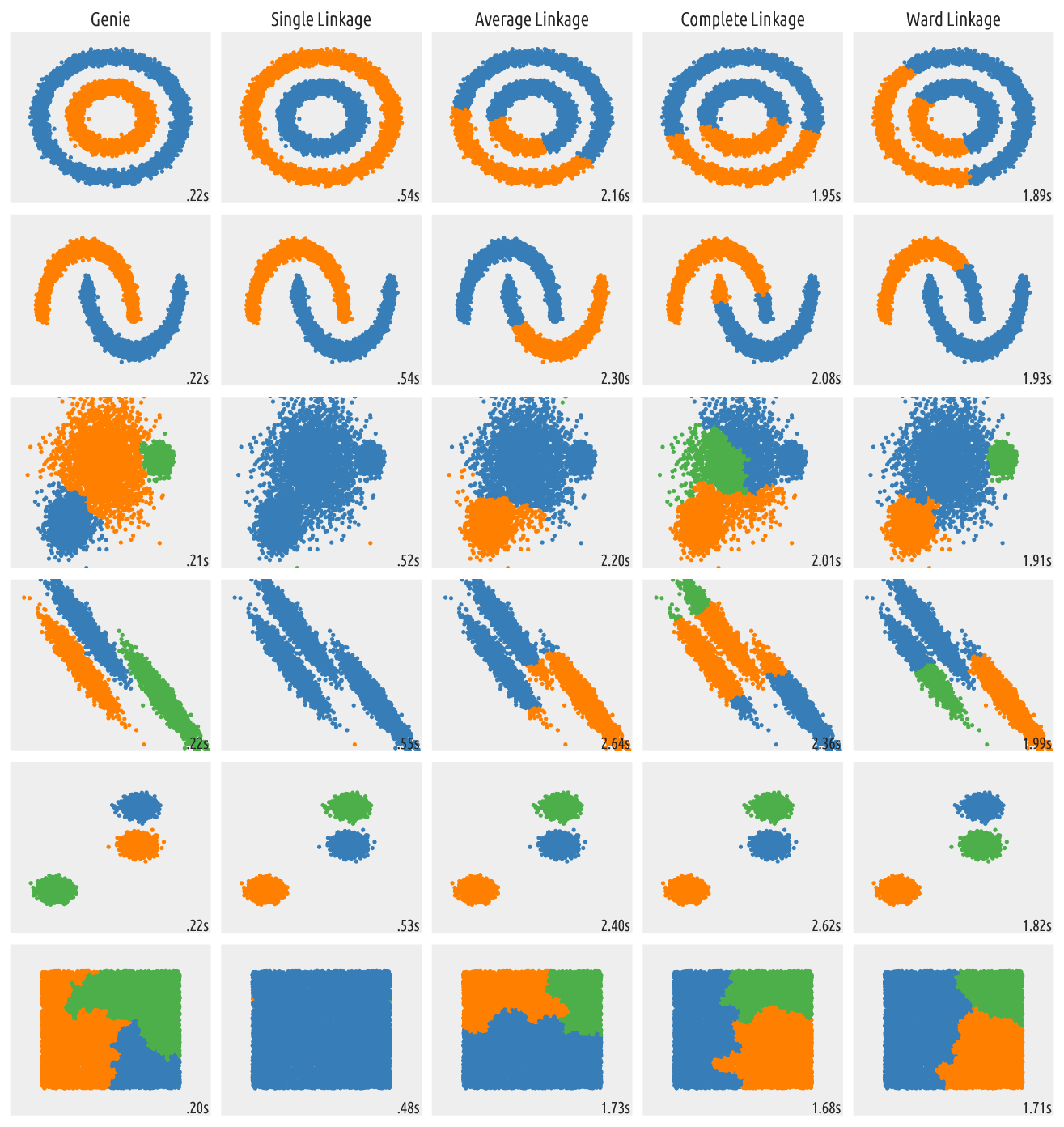
Figure 9 Outputs of clustering algorithms
The out-of-the-box Genie algorithm generates quite valid partitions. It is also the fastest among the above ones. Even though no algorithm is perfect in all the possible scenarios, try giving Genie a go in your next data mining challenge.
As with all distance-based methods (this includes k-means and DBSCAN as well), applying data preprocessing and feature engineering techniques (e.g., feature scaling, feature selection, dimensionality reduction) might lead to more meaningful results.