Basic Usage (Python)
Genie [9] is an agglomerative hierarchical clustering algorithm. The idea behind Genie is beautifully simple. First, it makes each individual point the sole member of its own cluster. Then, it keeps merging pairs of the closest clusters, one after another. However, to prevent the formation of clusters of highly imbalanced sizes, a point group of the smallest size will sometimes be combined with its nearest counterpart.
In the following sections, we demonstrate that Genie often outperforms other popular methods in terms of clustering quality and speed.
Here are a few examples of basic interactions with the Python version
of the genieclust [4] package,
which we can install from PyPI, e.g.,
via a call to pip3 install genieclust from the command line.
import numpy as np
import pandas as pd
import matplotlib.pyplot as plt
import genieclust
import deadwood

plot_params = dict(s=25, markers="o", alpha=0.5, asp=1)
Breaking the Ice
Let’s load an example benchmark set, jain [12], which comes
with the true corresponding partition (as assigned by an expert).
# see https://github.com/gagolews/genieclust/tree/master/.devel/sphinx/weave
dataset = "jain"
# Load an example 2D dataset:
X = np.loadtxt("%s.data.gz" % dataset, ndmin=2)

# Load the corresponding reference labels. The original labels are in {1,2,..,k}.
# We will make them more Python-ish by subtracting 1.
labels_true = np.loadtxt("%s.labels0.gz" % dataset, dtype=np.intp)-1

# The number of unique labels gives the true cluster count:
n_clusters = len(np.unique(labels_true))
A scatter plot of the dataset together with the reference labels:
deadwood.plot_scatter(X, labels=labels_true, **plot_params)
plt.title("%s (n=%d, true n_clusters=%d)" % (dataset, X.shape[0], n_clusters))
plt.axis("equal")
plt.show()
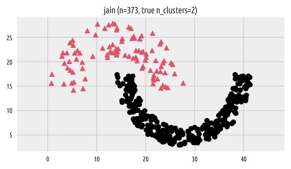
Figure 1 Reference labels
Let us apply the Genie algorithm (with the default/recommended
gini_threshold parameter value of 0.3). The genieclust package’s programming
interface is scikit-learn-compatible [15].
In particular, an object of class Genie is equipped with the
fit and fit_predict methods [1].
g = genieclust.Genie(n_clusters=n_clusters)
labels_genie = g.fit_predict(X)
For more details, see the documentation of the genieclust.Genie class.
Let’s plot the discovered partition:
deadwood.plot_scatter(X, labels=labels_genie, **plot_params)
plt.title("Genie (gini_threshold=%g)" % g.gini_threshold)
plt.axis("equal")
plt.show()
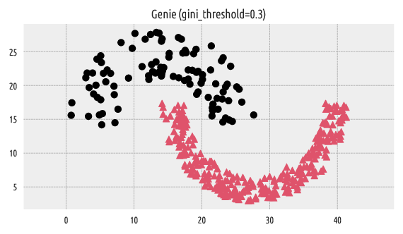
Figure 2 Labels predicted by Genie
We can compare the resulting clustering with the reference one by computing, for example, the confusion matrix.
# Compute the confusion matrix (with pivoting)
genieclust.compare_partitions.normalized_confusion_matrix(labels_true, labels_genie)
## array([[276,   0],
##        [  0,  97]])
The above confusion matrix can be summarised by means of partition
similarity measures, such as the adjusted Rand index (ar).
# See also: sklearn.metrics.adjusted_rand_score()
genieclust.compare_partitions.adjusted_rand_score(labels_true, labels_genie)
## 1.0
This denotes a perfect match between the two label vectors.
A Comparison with k-means
Let’s apply the k-means algorithm on the same dataset for comparison.
import sklearn.cluster
km = sklearn.cluster.KMeans(n_clusters=n_clusters)
labels_kmeans = km.fit_predict(X)
deadwood.plot_scatter(X, labels=labels_kmeans, **plot_params)
plt.title("k-means")
plt.axis("equal")
plt.show()
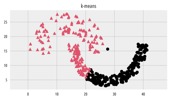
Figure 3 Labels predicted by k-means
It is well-known that the k-means algorithm can only split the input space into convex regions (compare the notion of the Voronoi diagrams, so we should not be very surprised with this result.
# Compute the confusion matrix for the k-means output:
genieclust.compare_partitions.normalized_confusion_matrix(labels_true, labels_kmeans)
## array([[197,  79],
##        [  1,  96]])
# A cluster similarity measure for k-means:
genieclust.compare_partitions.adjusted_rand_score(labels_true, labels_kmeans)
## 0.3241080446115835
The adjusted Rand score of \(\sim 0.3\) indicates a far-from-perfect fit.
A Comparison with HDBSCAN*
Let’s also make a comparison against a version of the DBSCAN
[3, 13] algorithm. The original DBSCAN relies on a somewhat
difficult to set eps parameter, which might be hard to tune in practice.
However, the hdbscan package
[14] implements its robustified variant
[2], which makes the algorithm much more user-friendly.
Here are the clustering results with the min_cluster_size parameter
of 3, 5, 10, and 15:
import hdbscan
mcs = [3, 5, 10, 15]
for i in range(len(mcs)):
    h = hdbscan.HDBSCAN(min_cluster_size=mcs[i])
    labels_hdbscan = h.fit_predict(X)
    plt.subplot(2, 2, i+1)
    deadwood.plot_scatter(X, labels=labels_hdbscan, **plot_params)
    plt.title("HDBSCAN (min_cluster_size=%d)" % h.min_cluster_size)
    plt.axis("equal")
plt.show()
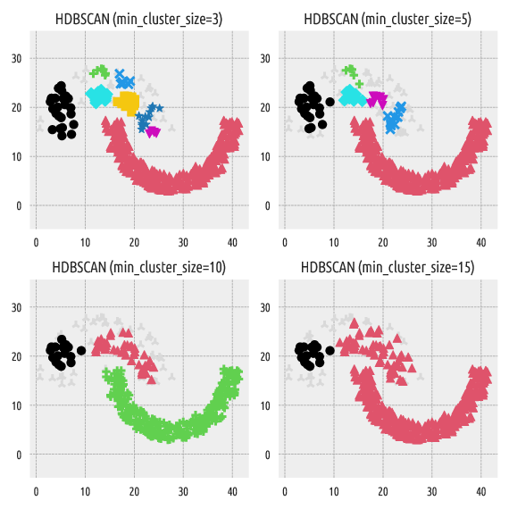
Figure 4 Labels predicted by HDBSCAN*
Note
Gray plotting symbols denote noise points/outliers. In another section, we will show that our package is compatible with an anomaly detection algorithm Deadwood.
In HDBSCAN*, min_cluster_size affects the “granularity”
of the obtained clusters. Its default value is set to:
hdbscan.HDBSCAN().min_cluster_size
## 5
Unfortunately, we cannot easily guesstimate in advance how many clusters
will be generated by this method. At first glance, it would seem that
min_cluster_size should lie somewhere between 10 and 15, but…
mcs = range(10, 16)
for i in range(len(mcs)):
    h = hdbscan.HDBSCAN(min_cluster_size=mcs[i])
    labels_hdbscan = h.fit_predict(X)
    plt.subplot(3, 2, i+1)
    deadwood.plot_scatter(X, labels=labels_hdbscan, **plot_params)
    plt.title("HDBSCAN (min_cluster_size=%d)"%h.min_cluster_size)
    plt.axis("equal")
plt.show()
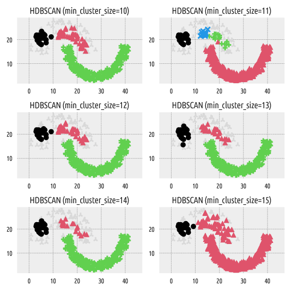
Figure 5 Labels predicted by HDBSCAN*
Strangely enough, min_cluster_size=11 generates four clusters,
whereas min_cluster_size=10 and min_cluster_size=12 yield only three point groups.
On the other hand, the Genie algorithm belongs
to the group of hierarchical agglomerative methods. By definition,
it can generate a sequence of nested partitions, which means that by
increasing n_clusters, we split one and only one cluster
into two subgroups. This makes the resulting partitions more stable.
ncl = range(2, 8)
for i in range(len(ncl)):
    g = genieclust.Genie(n_clusters=ncl[i])
    labels_genie = g.fit_predict(X)
    plt.subplot(3, 2, i+1)
    deadwood.plot_scatter(X, labels=labels_genie, **plot_params)
    plt.title("Genie (n_clusters=%d)"%(g.n_clusters,))
    plt.axis("equal")
plt.show()
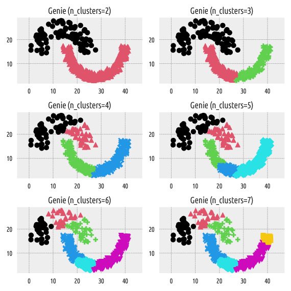
Figure 6 Labels predicted by Genie
Dendrograms
Dendrogram plotting is possible with scipy.cluster.hierarchy:
import scipy.cluster.hierarchy
g = genieclust.Genie()
g.fit(X)
linkage_matrix = np.column_stack([g.children_, g.distances_, g.counts_])
scipy.cluster.hierarchy.dendrogram(linkage_matrix,
    show_leaf_counts=False, no_labels=True)
plt.show()
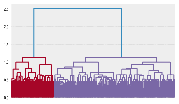
Figure 7 Example dendrogram
Another example:
scipy.cluster.hierarchy.dendrogram(linkage_matrix,
    truncate_mode="lastp", p=15, orientation="left")
plt.show()
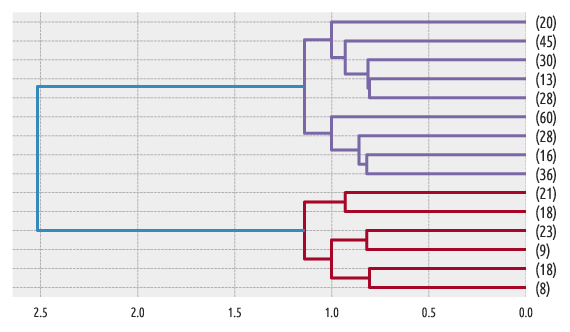
Figure 8 Another example dendrogram
For a list of graphical parameters, refer to this function’s manual.
Further Reading
For more details, refer to the package’s API reference manual:
genieclust.Genie.
To learn more about Python, check out Marek’s open-access textbook
Minimalist Data Wrangling in Python
[7].